Branding Your Website
MotorDesk allows for significant customisation of your website to reflect your brand.
A great place to start is with the website 'Branding' features, which you can find by going to the 'Website' header menu and navigating to the 'Branding' subcategory which contains pages for customising your Logo, Fonts, Icon, Styles & Colours.
Logo
The Website -> Branding -> Logo section enables you to upload your business logo. Simply upload a PNG or GIF file of your logo and this will be used in any instances of the logo appearing on your website. JPEG files are supported but are not recommended for most logos.
There are two uploaders on this page, one for uploading your regular logo and one for uploading a version of your logo that will work on light backgrounds (such as your invoice header). If your main logo does work on a white background, then you can ignore the second uploader.
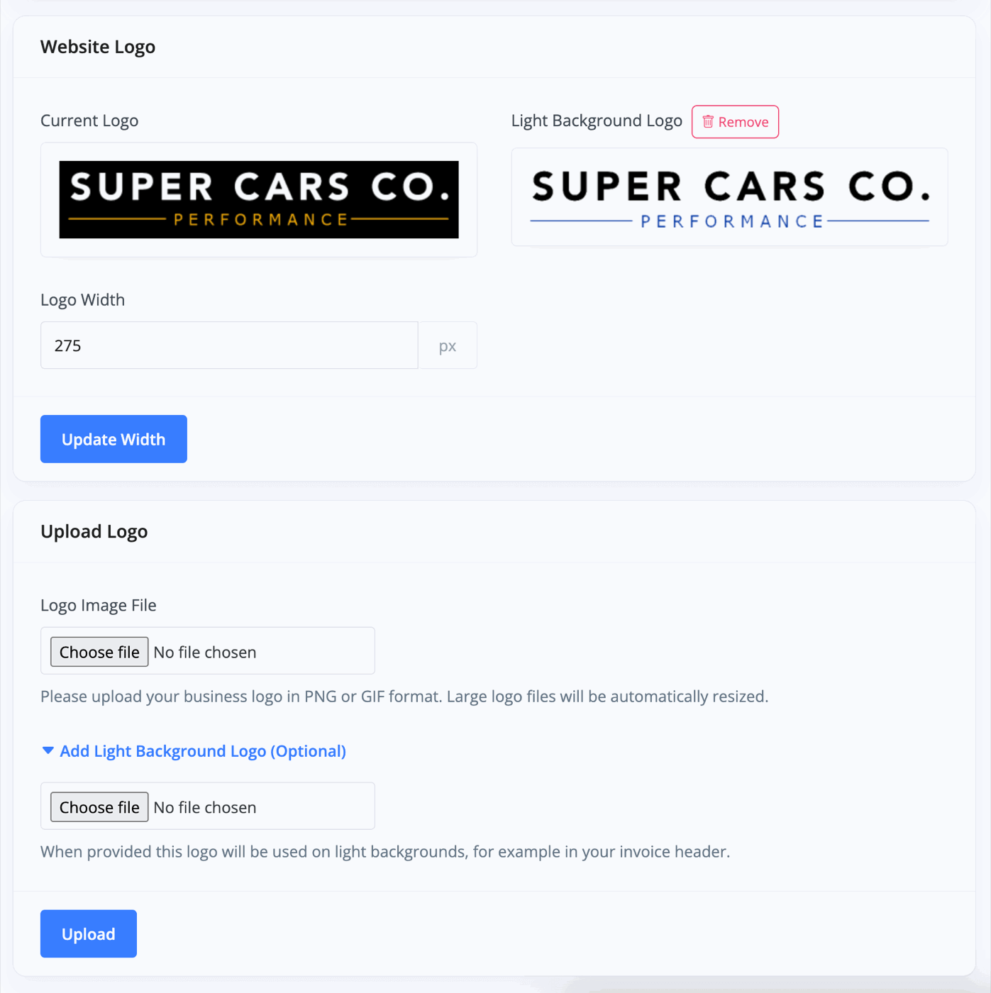
Once you add your file, you can customise the width of the photo in pixels. Our recommended width is around 200px. Click 'Upload' once complete.
Please ensure the logo file you upload is a suitable format and a suitable size, we recommend you do not upload logos larger than 2000px.
Icon
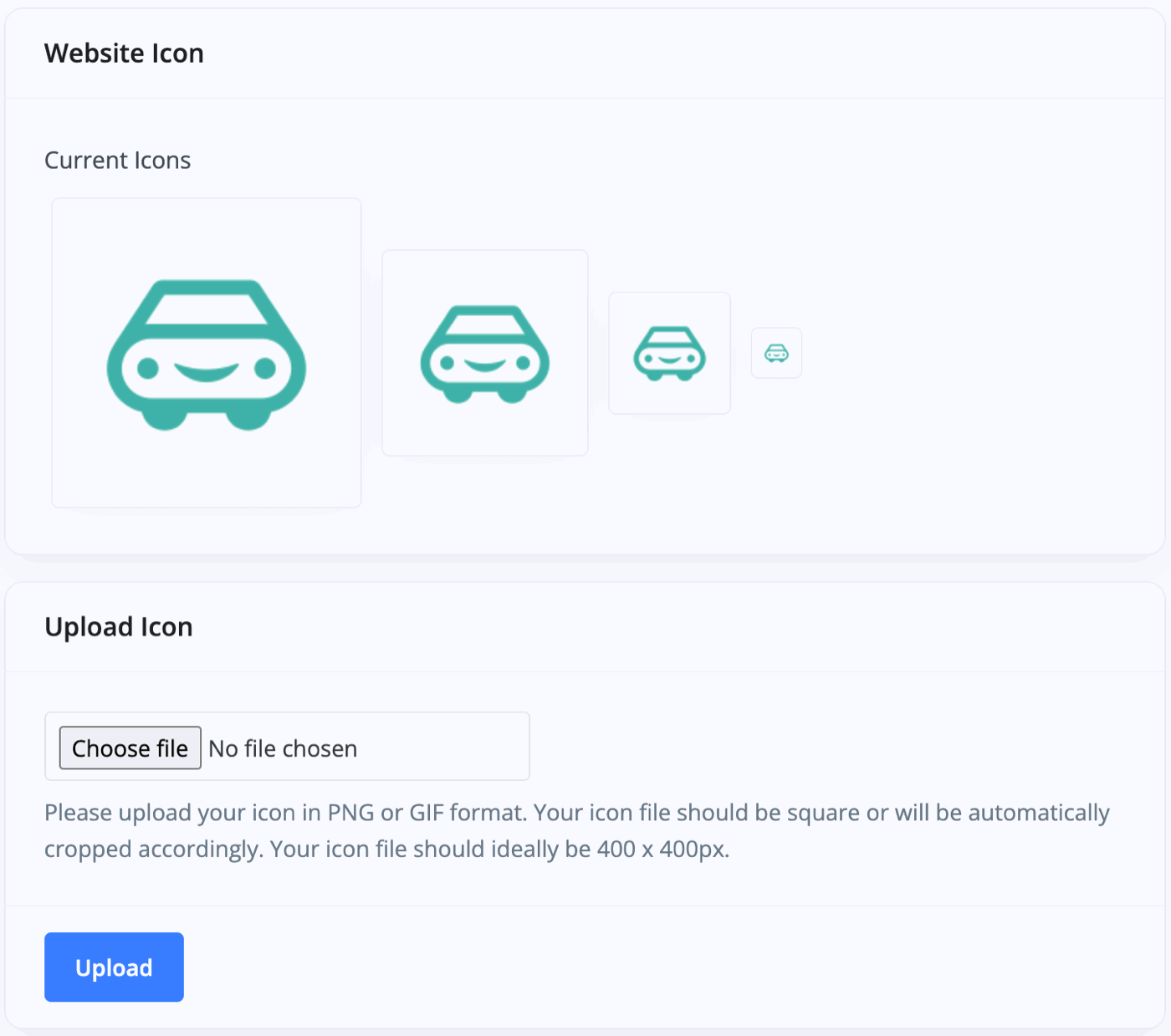
The Website -> Branding -> Icons section is a simple photo uploader to add your business icon. We recommend an image size of 400x400 pixels.
The icon appears in the 'tab' of the web browser being used to view your site and also in social media posts when posting a link to your site. The icon will also be generated as a favicon.ico file to be used in your web browser tab heading, and the icon will also be used by third-party websites such as search engines.
Colours
The Website -> Branding -> Colours section allows you to manage your colour palettes and create different colour styles that can be applied when editing website elements. These styles help maintain consistency across your site by ensuring your brand colours are used throughout. You'll also find drop-down menus for selecting from a range of colours displayed on your website.
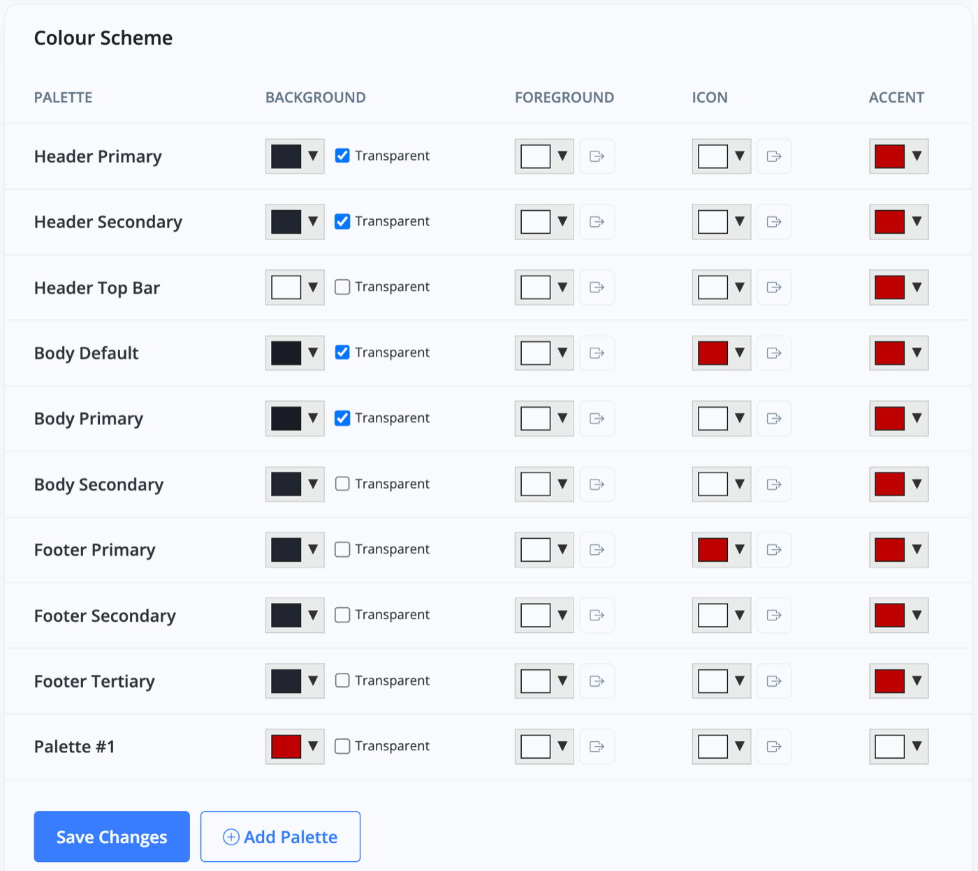
Foreground colours are used for elements placed on top of the background, such as text or buttons.
Accent colours can be applied to buttons, they may also be used in some web design templates to highlight elements.
Additional custom colour palettes can be created as required.
When palette backgrounds are set to be transparent the background colour/image set in your Website Styles will show through. It is still important to set a palette background colour as this colour may be used for other elements such as buttons.
There is a 'Bulk Swap Colours' tool designed for quickly experimenting with your colour layout on different aspects of the website.

Fonts
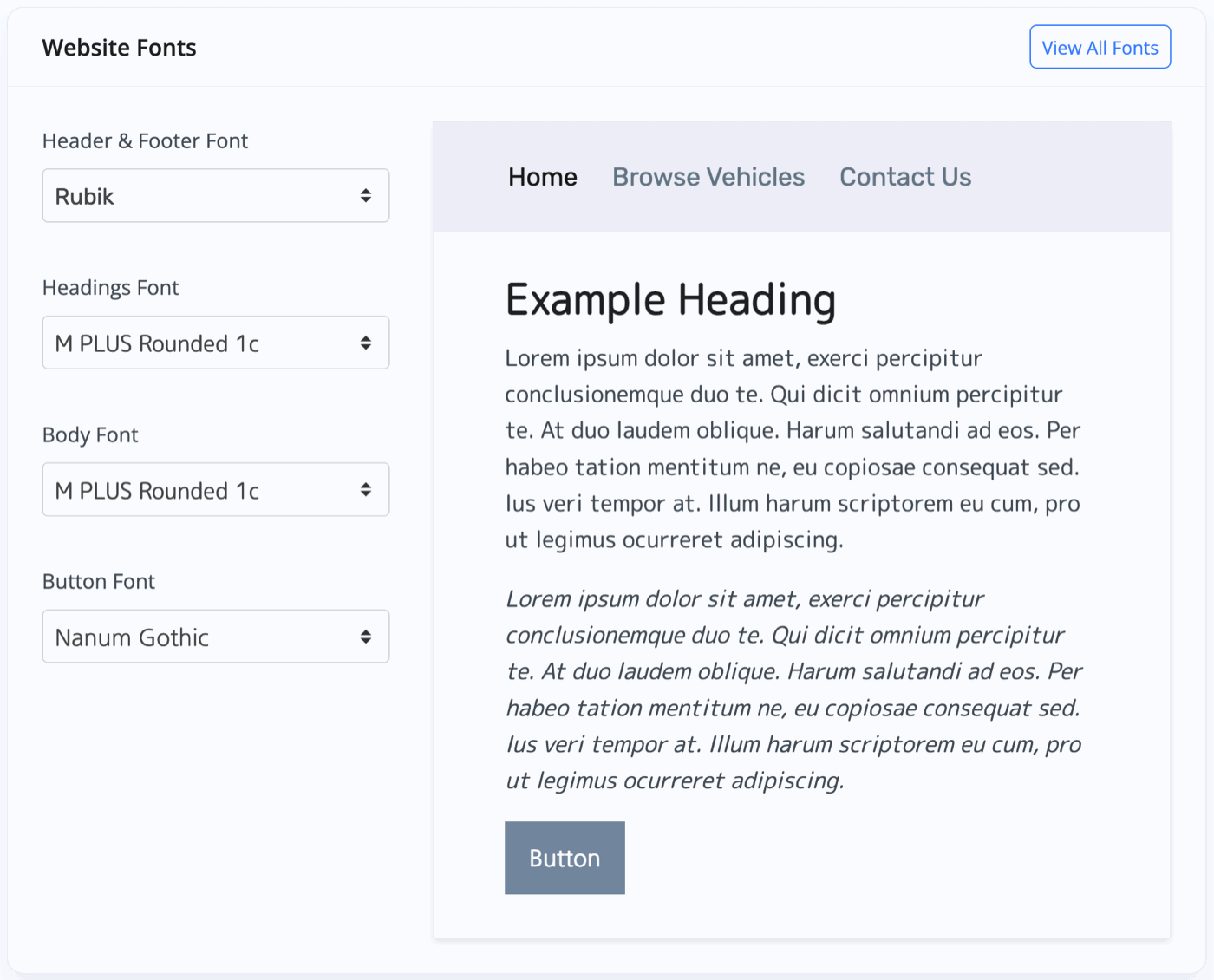
The Website -> Branding -> Fonts section allows you to choose which fonts will be used for your website text. In this section, you'll see that you can choose a different font for your navigation bar, header & website footer, the headings of your web pages, the main bodies of text on your website and also the font that appears in buttons on your website.
All of these fonts can be selected with drop-down menus for each category and you're given a preview of your choices live on the right hand side. As most fonts are subject to strict licenses MotorDesk only uses Google Fonts. If you'd like to use a Google Font which is not listed, please contact support. We will be happy to add the font as an option.
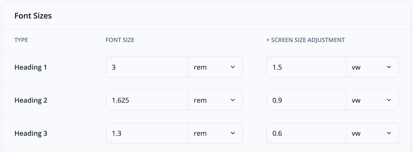
You can also change the website's font sizes from the default sizes if you wish. You'll see a table containing the categories of text and a box to manually enter the font size and a drop-down menu to select the measurement unit of the text (e.g. rem or pixels).
The screen adjustment sizes refer to how the font sizes change when your website is viewed on a smaller browser window or smaller screen such as a tablet or smartphone, enabling text to scale with the screen width.
Always make sure to click 'Save Changes' at the bottom once you've finished editing.
Styles
The Website -> Branding -> Styles section allows you to customise some of the details of your website aesthetic, such as background colour/image and how text boxes appear on your site.
Website Width
This is where you'll be able to choose the layout of your website, such as how much of a gap you'll leave at the side of the screen. By default, websites limit the width they stretch to when being viewed on large screens. You have the option to make it fill the screen or to keep it contained.

Website Background
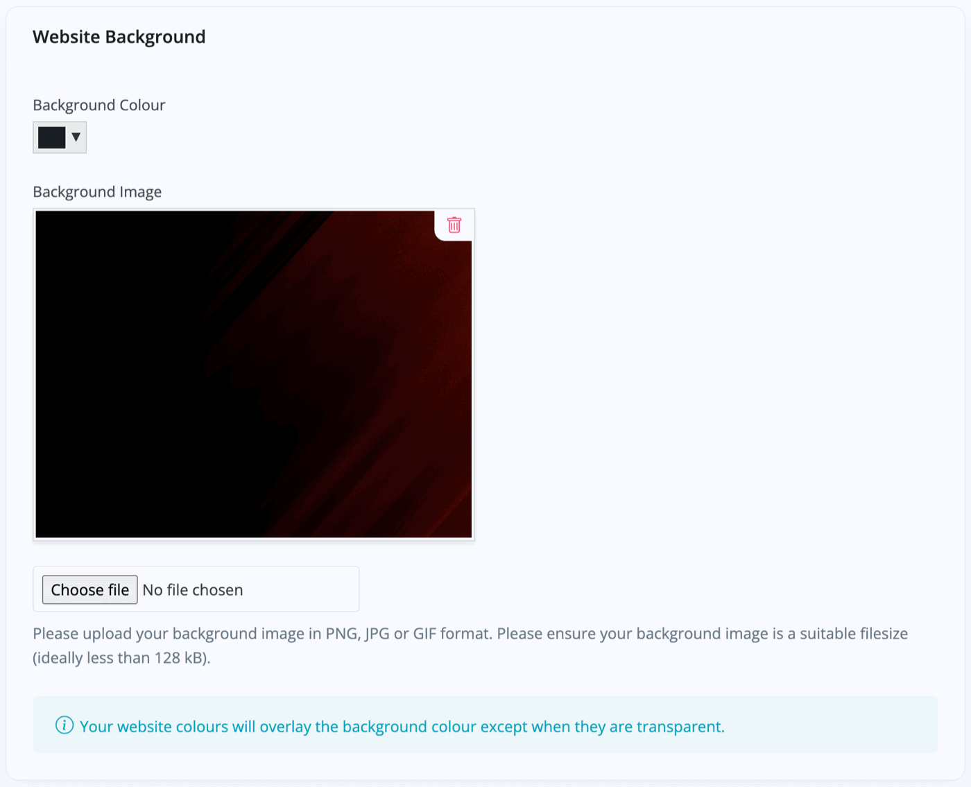
This is where you can select the colour for your website background, or indeed a background image. The drop-down colour picker will let you choose a colour or enter a hex colour code if you have a specific colour for your brand.
The image uploader simply requires you to upload a JPEG, PNG or GIF image file. Make sure to click 'Save Changes' at the bottom of the page once you've finished editing.
Where these backgrounds appear depends on the website template that you've used, and your usage of transparent background colours to allow the background to show through.
Website Load Effect
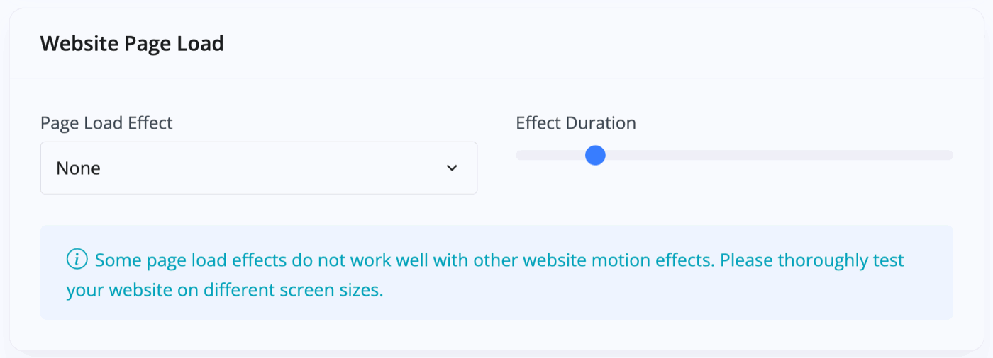
This lets you choose the look of the transition between web pages on your site. Without any effect chosen, the pages will simply cut between each other, but you can change this so that the new webpage slides or fades in. There are a range of effects to try and see how they work on your site.
Rounded Corners & Shadows
These are aesthetic choices you can make for your website. Rounded corners lets you choose how smooth or rounded the edges of content boxes appear on your website. The shadow settings drops a shadow behind the box to give it a 3D look.
The rounded corners are measured in pixels but it's very easy to make a change and quickly check how it looks on your site. The shadow settings come with a preview you can see when choosing your shadow style.
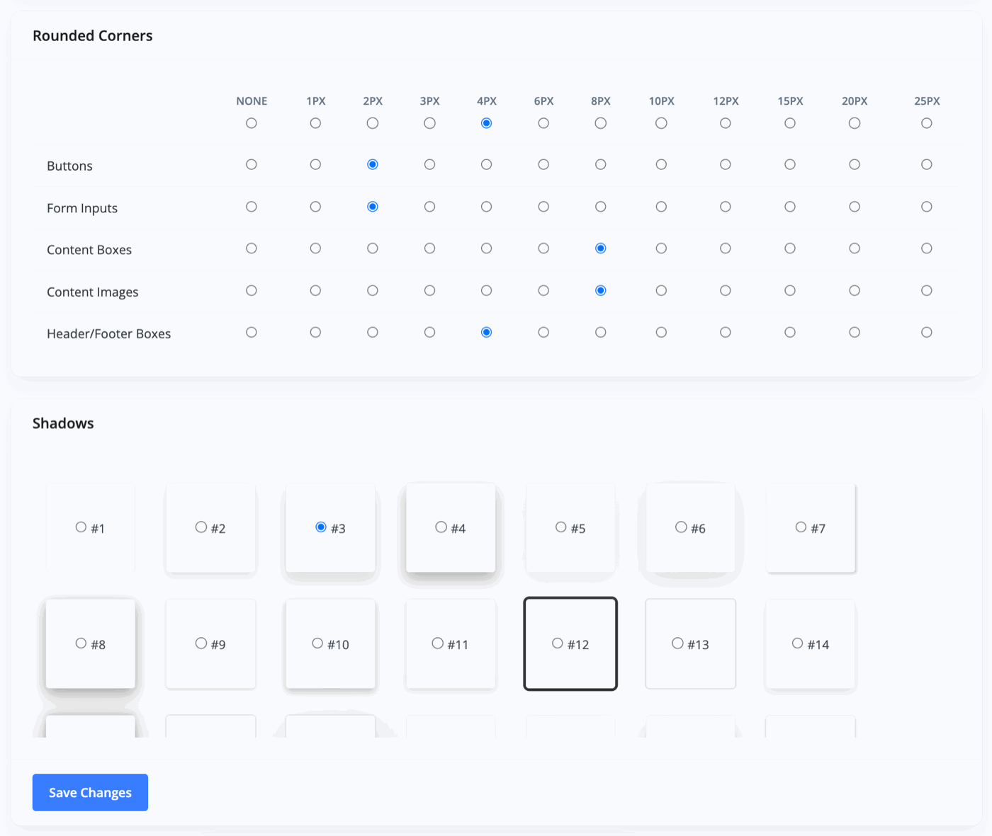
You can simply check the settings that you'd like and click 'Save Changes' once complete.
Related Documentation
Usage Guide
- Account Alerts & Sales Channel Error Notifications
- Adding & Managing Contacts (Customers & Suppliers)
- Adding A Vehicle
- Adding Appointments To Your Calendar
- Adding Pre-Defined Products & Services
- Adding Website Pages & Navigation Links
- Adding Website Tags
- Aftersales Invoices
- AI Lead Assistant
- AI SEO Search Results Explained
- Batch Invoice
- Booking Types & Website Booking Forms
- Branding Your Website
- Browse Vehicles
- Business Contact Details (Telephone & Social Media)
- Business Details (Address, Legal Name & Company Number)
- Business Follow-Ups - Automated SMS & Emails To Customers
- Business Opening Hours (and Holiday Closures)
- Business Social Networks
- Business Users & Roles
- Cancelling A Vehicle Sale or Reservation
- Changing Vehicle Registration (Number Plate)
- Changing Your Membership Plan
- Connecting Finance (iVendi, Codeweavers, CarFinance247 & Evolution Funding)
- Connecting Third-Party Services
- Creating Invoices, Purchase Invoices & Orders
- Customer & Courtesy Vehicles
- Deal Builder
- Display A Different Business Address In MotorDesk
- Displaying Announcements With Website Banners
- Editing Auto-Generated Content In MotorDesk
- Editing Website Pages
- Exporting Business Data
- Filtering Junk Leads
- Handover Process
- Historic Data Viewer
- How MotorDesk Integrates with Sage, Xero & QuickBooks
- How to Add an AA Dealer Promise/Warranty Page
- How To Change Your Website Images
- How To Enable Online Reservations
- Importing Business Data
- Importing Your AutoTrader Stock
- Initial Website Set-Up & Picking A Website Template
- Invoice Customisation
- Membership Payments
- Membership Plans, Data Charges & Payments
- Navigating MotorDesk & Your Dashboard
- OCR (Automatic Invoice Reader) Help
- Remove A Vehicle
- Sales Leads & Chat
- Sales Reports
- Selling A Vehicle
- Selling Multiple Vehicles At Once
- Sending & Signing Documents
- Show Sold Vehicles On Website
- Taking Deposits & Part Payments In MotorDesk
- Un-Publish A Vehicle
- Updating Your Contact Details
- User Profile (Change Email & Password)
- Vehicle Analyser
- Vehicle Appointments
- Vehicle Check
- Vehicle Checklists
- Vehicle Competitors
- Vehicle Condition Reports
- Vehicle Details
- Vehicle Documents
- Vehicle Finance Invoices
- Vehicle History
- Vehicle Image Templates
- Vehicle Images & Videos
- Vehicle Import
- Vehicle Job Boards
- Vehicle Leads & Orders (Leads & Deals)
- Vehicle Locations
- Vehicle Optional Extras, Features & Descriptions
- Vehicle Overview
- Vehicle Photo Background Removal
- Vehicle Purchase & Costs
- Vehicle Quick Check
- Vehicle Reservations
- Vehicle Settings
- Vehicle Silent Saleman
- Vehicle Specification
- Vehicle Stock & Price
- Vehicle Test Drives
- Vehicle Workflows
- Vehicles For Sale Limit Reached
- Vehicles Settings
- Vehicles Stock Book
- Website AI SEO
- Website Banner Settings
- Website Blog Articles
- Website Customer Reviews
- Website Deal Builder Settings
- Website Header & Footer
- Website Live Chat Settings
- Website Settings
- Website Statistics
- Website Valuation Settings
- Website Vehicle Search Result Design